
Here’s a peek at one of the tools I’ve been messing with, which is a scatter plot generated by the handicapping app we are developing.
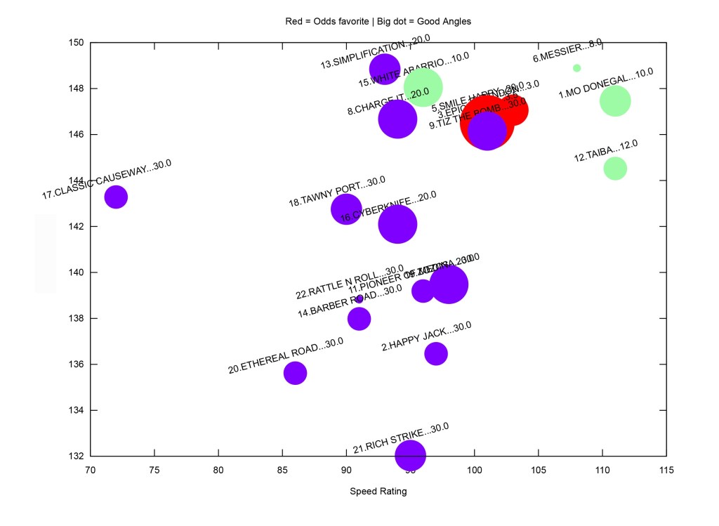
The axis are based on speed and power ratings, and the upper right corner is generally where you want to live. The size of the dots is based on the angles we have built into the program – the bigger the dot, the more positive angles. Red = stop for short odds, green are mid-priced, and blue is bombs away.
It’s a way to get a lot of data quickly sorted, and you can see there is a clear split between the top nine in the upper right and everyone else.
I don’t substitute this for all my handicapping, but it’s a good starting point.
I’m de-emphasizing Mo Donegal and Taiba based on post and inexperience respectively.
Messier is one I can’t keep off the tickets, and he may be underbet given all the Baffert hoopla.
Epicenter has a huge dot – plenty going his way. Not a win bet but a key in the exotics. Charge it and Tiz the Bomb I’ll use underneath to try to juice up a ticket.
Been working on the app off and on for a little over a year, hopefully a lot more time to refine this summer. But in the meantime check it out and let me know what you think of the format, and we’ll see how it plays in the 2022 Kentucky Derby.
